In this episode of our design series “House Stories,” we take a look at a very personal project for one of our clients. This cottage home in Marblehead, Ohio sits right on Lake Erie and is the childhood summer home of our customer. It needed a refresh from its original design dating back decades ago. We kept the charm, but gave it a serene transformation.
In this episode of House Stories with Herman’s Furniture, we’re going to show you a complete redesign of an owner’s childhood Cottage in Marblehead. The before and afters of this home are a drastic change. The original home was adorned with bright colors, bold patterns, and included an assortment of furniture. For the redesign, our designers and the homeowner wanted to create a peaceful home that reflects the laid-back vibe of this vacation destination, but they didn’t want anything overly coastal or nautical. The full design makeover looks like a restful escape mixed with touches of modern aesthetics.
The sitting area transitioned from an array of furniture to an open space with matching sofas, additional custom seating, and blue-tone fabrics and area rugs that anchor all of the pieces together.
As a nod to nostalgia, the original wood flooring was kept and refinished. But as you walk through the house, you’ll see that the designer chose to soften the rooms with various shades of blues, creams, and whites. The old furniture was replaced with comfortable and timeless pieces from Herman’s.
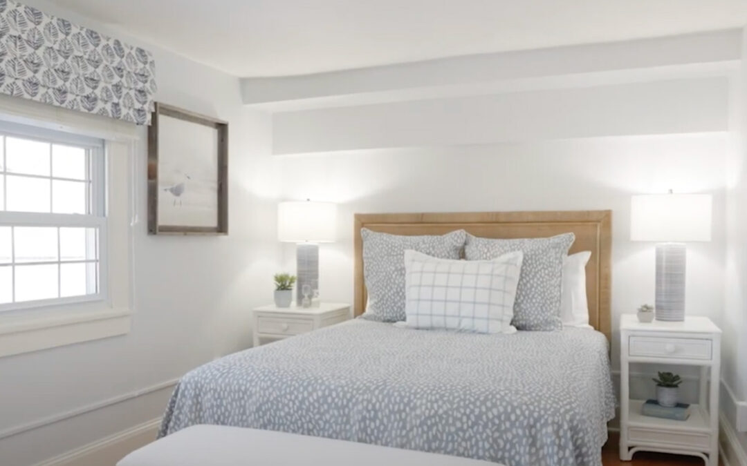
The primary bedroom went through the biggest change. The original bed had an iron bed frame with a pop-up trundle. It was replaced with this modern rattan headboard. The designer created more space in the room by eliminating a footboard. The wall color, bedding, window treatments, and lamps are monochromatic with touches of texture, while white trim and white nightstands were chosen to brighten up the room. To keep this room looking clutter-free, the designer chose simple wall art and minimal accessories.
There are tricks to designing small spaces to make them feel larger. The guest bedroom is tiny, and the original bed took up three-quarters of the room. The updated room has a smaller bed with an antique-style bed frame, soft floral fabrics, a modern wall sconce, and this smaller dresser with a vintage finish.
The dining area was given a fresh, updated look. The new look includes this oval-shaped table to soften out the edges in the room. A set of custom-made herringbone fabric chairs are paired with woven chairs for a crisp look. The outdated light fixture was replaced with this modern steel chandelier for clean and sophisticated lighting. And this beautiful faux centerpiece, specially crafted at Herman’s, is low maintenance with high-quality aesthetics.
If you need some help designing your dream home or room, book an appointment with the design team at Herman’s Furniture and Design.
Be sure to subscribe to our YouTube channel and follow us on Instagram and Facebook for more inspiration.

